A friend of mine owns a narrow row house with a bathroom that could charitably be called snug. Roughly five feet by seven, with the door swinging inward and a window on one wall. For years the room was ruled by a bulky builder-grade vanity that ate half the floor and offered almost no usable storage. She was convinced the only fix was knocking down a wall. It wasn’t. The fix was the vanity, and the story is worth telling because the same principles apply to a lot of tight bathrooms.
I helped her work through it, and what struck me was how many of the improvements came from decisions that cost nothing extra. It wasn’t about spending more. It was about choosing better. Here’s how the room went from claustrophobic to comfortable.
The starting problem: mass in the wrong places
The original vanity was a solid box that ran to the floor and stuck out a full standard depth. In a room that size, that mass did two things, both bad. It shrank the visual space, making the room feel like a closet, and it forced everyone to squeeze past it to reach the shower.




The storage, ironically, was poor despite the bulk. A single cabinet with one shelf, most of the space swallowed by the plumbing. So the vanity was simultaneously too big for the room and too small for her stuff. That contradiction is the signature of a badly matched vanity, and it’s incredibly common in older bathrooms.
The first insight was simply naming the real problem. It wasn’t that the room was too small. It was that the vanity used the available space terribly. Reframing it that way opened up options that didn’t involve demolition.
See also: About Datrihelminen Life
Decision one: get it off the floor
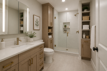
The change with the biggest visual payoff was switching to a wall-mounted vanity. Floating the cabinet a few inches off the floor exposes the tile underneath, and that visible floor tricks the eye into reading the room as larger. It’s the same reason a room with visible floor under the furniture feels more open than one where everything sits flush to the ground.
There was a practical bonus too. The exposed floor is easier to clean, with no awkward gap beneath a heavy cabinet collecting dust. Browsing the Entrepôt de la Réno bathroom vanities selection, we filtered specifically for wall-mounted models, which made it easy to compare the floating options side by side instead of wading through everything. The wall-mounted choice alone transformed how big the room felt, before we’d changed anything else.
Decision two: reduce the depth, keep the function
Standard vanities run about twenty-one inches deep. In a narrow room, those few inches are the difference between squeezing and walking. We found a shallower model, closer to eighteen inches, which reclaimed critical floor space in the traffic path.
The worry with a shallower vanity is losing storage or ending up with a cramped sink. The answer was choosing one designed for the reduced depth, with a sink shaped to fit and drawers configured to work around the plumbing rather than fighting it. Reduced depth didn’t mean reduced usefulness. It meant a cabinet engineered for a small room instead of a big one shoehorned in.
Decision three: drawers over doors
The old cabinet had a door, and behind it, a black hole where things disappeared. We switched to a drawer configuration. Drawers pull the contents out to you, so nothing gets lost in the back, and they organize small bathroom items far better than an open shelf.
The clever part was working around the plumbing. A U-shaped drawer, notched to clear the drain, recovers storage that a standard drawer would sacrifice. Little details like that are why looking closely at a vanity’s internal layout matters more than its exterior. Two vanities that look identical from the front can differ enormously in how much they actually hold.
Decision four: light colour, continuous look
The final move was aesthetic but functional. We chose a light finish for the vanity and a wall-hung mirror above it that ran nearly the full width. Light surfaces bounce light around and enlarge a space, while a large mirror doubles the visual room and brightens everything by reflecting the window.
We also kept the finish continuous with the surrounding palette rather than introducing a contrasting heavy colour that would have chopped the small room into pieces. In tight spaces, visual continuity reads as calm and openness. Busy contrast reads as clutter.
Decision five: coordinate the whole wall
There was a fifth move that pulled the others together, and it involved thinking beyond the vanity to the entire wall it sat on. A vanity doesn’t live in isolation. It shares a wall with the mirror, the lighting and the faucet, and in a small room, disorder among those elements reads as clutter fast.
We treated the vanity wall as a single composition. The mirror width related to the vanity width. The faucet finish matched the drawer pulls. The lighting was positioned to work with the mirror rather than fighting it. None of this cost more than choosing those items randomly would have. It just required deciding them together instead of one at a time.
The effect in a small space is outsized. When every element on the main wall relates to the others, the eye reads calm and intention. When they clash, even subtly, a tight room feels busier and smaller than it is. Coordination is essentially free, yet it does as much for a cramped bathroom as any structural change.
That principle, designing the wall as a whole rather than assembling parts, applies to bathrooms of any size. In a small one, it’s the difference between tidy and chaotic.
The result, and the lesson
The bathroom is the same physical size it always was. Not one wall moved. Yet it feels dramatically larger and functions far better, and my friend now has more usable storage than the old bulky cabinet ever gave her. The whole change came from four vanity decisions: float it, shrink the depth, choose drawers, keep it light.
The broader lesson applies well beyond her row house. When a small bathroom feels impossible, the instinct is to assume you need more square footage. Usually you don’t. You need the fixtures to stop wasting the square footage you have. A vanity chosen for the room, rather than pulled off a shelf because it fit the wall width, changes everything.
Established fixture brands like Moen and Delta get plenty of attention, and they matter for the faucet. But in a small bathroom, the vanity is the decision that makes or breaks the space. Choose it as carefully as my friend eventually did, and you may find, as she did, that the wall you were ready to demolish was never the problem.